Oil Painting – the Process

- Layer 1 – washes of color
I generally work from a photograph or two. A striking color, or dramatic lighting will catch my eye. I’ll snap a few photos to catch the moment. Sometime I need a set of photographs to capture the details of the shadows and the highlights which one photo cannot capture both well. I choose my composition with a balance of shadow and light. I like to paint big so the 4×6 inch photo I paint from becomes a 2×3 foot or larger. I determine my final size, cut the primed canvas, and hand stretch all my own canvases. This gives me the freedom to fit my canvas to my composition rather than the reverse.
I draw the basic lines of the objects, shadows and lights with pencil. Correcting errors in drawing like proportions before any paint is applied. I follow a traditional oil painting technique building layers of

- Layer 2 – thin paint with more depth
oil painting fat on thin. Thinned (faster drying) oil paint is applied in almost a watercolour wash covering the canvas. Again the drawing is checked for mistakes and the layer is allowed to dry. A second oil paint layer (slightly fatter in oil) is added, dramatically deeper of hue, slightly thicker but without apparent brush strokes. Pencil marks may still show through the more transparent colors like the yellows. Yet the painting at his stage has taken on some of the depth the final painting will have. The darks have not attained their full richness but their colored bases are evident. I never paint with black or greys out of the tube. My darks are always deep rich hues like Alizaron crimson, Ultramarine Blue, or Viridian reflecting the colors of the lighter areas while giving volume to the depths.
I tend to paint with restricted palette based on my subject. I use

- Layer 3 – thicker buttery paint and details
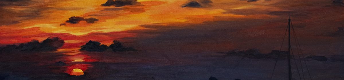
the pure hues in the sunny areas and blends of the same hues to create the greys, browns, and faded tones of distance. Colors of Conch had a light palette with about 8 hues making up the full range of colors and tones. By mixing my own grays, I was able to shift them from warm to cool simply by varying the proportions of the same two hues. The grays harmonize – one is sun, one is shadow.
The third layer of paint has no thinner. It is thicker like butter. It coats the depths with pools of smooth color. It brings solid structure to the objects and builds the middle tones. Details are added in this layer. Brush strokes may be left in or skimmed away to the best effect. I push the limit from light to dark building depth and volume. Sometimes this is the last layer, sometimes there are more. The paint, the subject, all rolled in one dictates the final moment.
Is it done? Now I spend minutes staring at the painting, stepping back a few feet, a few feet more. I squint. I meditate. I feel the painting as a whole. I dab a little in the darkness or whisk in some detail in the objects surface. Sometimes not touching it for a half hour or more. Finally, it is really ALMOST done. I hang it on the wall and live with it. It greets me anew every time I enter my studio. I see it in sunshine, shadow or artificial lighting. I might dab at it or not. I sign it days or weeks later when it really is done.

- Color of Conch completed